


_logo%201.svg)


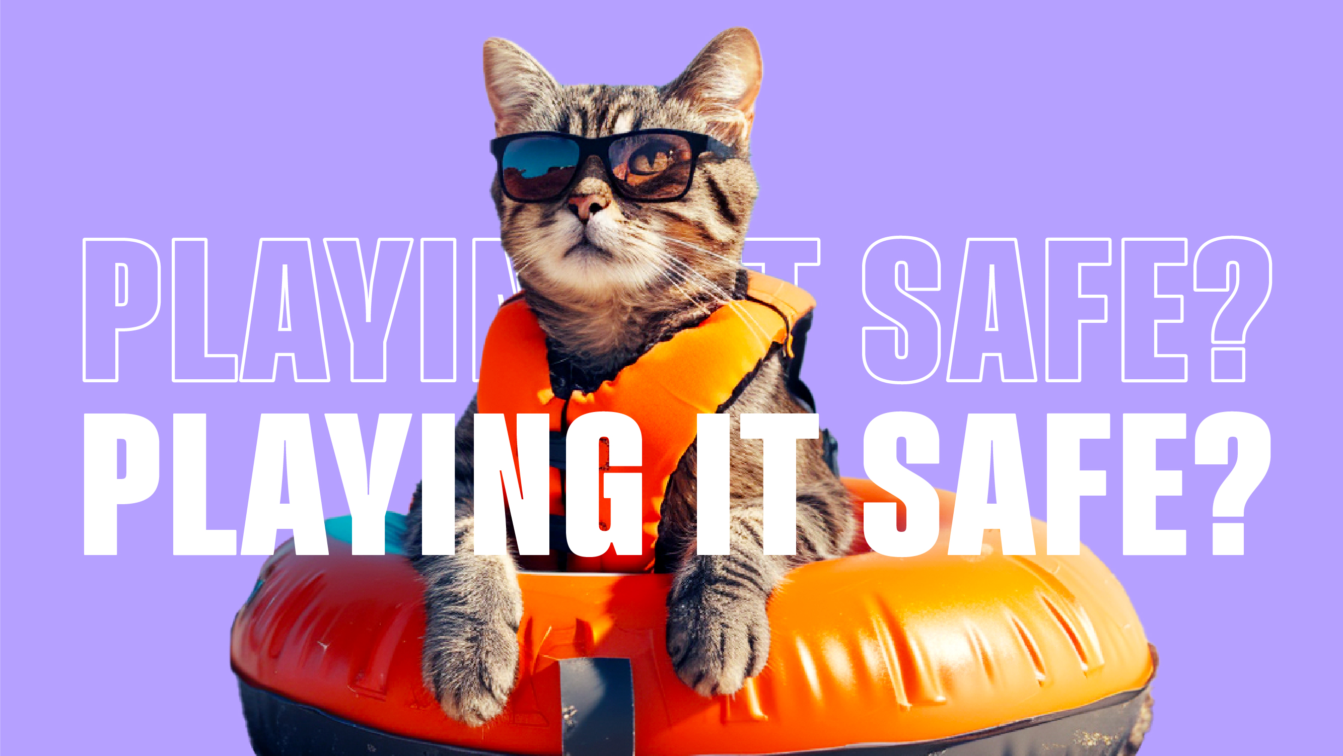
The Midlife Crisis of Branding: Why 2025 Rebrands Are About Playing It Safe
Once upon a time, a rebrand was a statement. It was a leap, a bet, a “you’re going to notice this whether you like it or not” moment. Think Burberry’s bold rebranding or Airbnb’s 2014 “Bélo” that sparked countless memes. Whether you loved or hated them, you could not ignore them.
But 2025? The vibe has totally shifted. Rebrands these days feel less like headline-grabbing moments and more like background noise—quiet tweaks, safe colour swaps, and font updates so subtle you might miss them if you blinked. It’s like brands have collectively decided that making a splash is risky business, so they’re opting for “tidy and polite” instead of bold and memorable. The result? A wave of sameness washing over the market, where nothing stands out and everyone just looks… well, a bit too comfortable.
Why Everyone’s Playing Nice
This is not just design fatigue. There are real forces at work.
Economically, brands are feeling the squeeze. Big bets feel risky when market conditions are shaky, and stakeholders often push for changes that will not ruffle feathers. Culturally, the fear of backlash looms large. In the age of viral takedowns, the safest move is often the most forgettable one. And internally? Rebrands that need unanimous executive approval rarely end in daring, divisive work. It is hard to make something distinctive when the brief is, “Let’s make it modern but not too modern. Fresh but familiar.”
The result is that “consistent” starts looking a lot like “same”. When you stack up this year’s design reveals, from Evernote’s subtle palette shift to Prada’s clean-up of its wordmark, you can almost see them blending together in a single mood board of sans-serif fonts and safe colour swatches.
The Risk of Playing it Too Safe

Here’s the irony – in trying to avoid risk, brands may be taking the biggest risk of all by fading into irrelevance. When everyone is simplifying, desaturating, and decluttering, the visual noise does not actually go away. It just becomes uniform. In that sea of polite minimalism, even a small dose of specificity, a colour that refuses to mute itself or a voice unafraid to stand out, suddenly feels radical.
Take OpenAI, for instance. A company growing at lightning speed in one of the most disruptive, risky industries out there, yet their logo feels like it was the result of asking their own AI for the safest, most forgettable design possible. In a space buzzing with bold innovation, their branding plays it so safe it is almost comical, proof that even the trailblazers sometimes get stuck in the beige zone.
From Midlife Crisis to Brand Renaissance
If we think of 2025’s cautious branding as a collective midlife crisis, the way out is not to swing wildly in the opposite direction. You do not need to buy the metaphorical sports car. You just need to remember who you are. That means re-anchoring in your purpose, your audience, and your distinctiveness before you even touch a font file.
The strongest rebrands this year will be the ones that use this moment not to retreat into sameness but to sharpen their clarity. Boldness does not have to mean provocation. It can mean owning your niche with confidence and speaking directly to your tribe instead of trying to please everyone. In an environment where everyone is playing nice, confidence reads as bold.
Because Nobody Remembers the Wallflowers
If 2025 has taught us anything, it is that beige does not break the internet. The brands we remember are the ones that take a deep breath, step out of the comfort zone, and make us feel something. At Superminted, we don’t do safe. We do smart, bold, and a little bit daring – the kind of branding that makes people stop scrolling and start talking. Ready to drop the beige and shake things up? We’re waiting.


.png)
you may also like
Subscribe to get notified when new downloadables drop. Straight to your inbox.
Take it one step further. Book a free consultation with us and let’s talk strategy.

.svg)

