


_logo%201.svg)


POP

Stay safe, stay sexy
POP is a condom brand targeted at youths to practise safe sex by making it appealing through the use of bright colours and cheeky patterns.

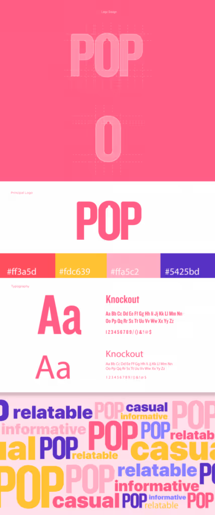
Logo
The imagery of a condom is portrayed through the use of negative space in the letter ‘O’ of POP’s logo. The colours of POP are bright and vibrant but still comfortable on the eyes, reflecting the excitement of the initial experiences in sex.
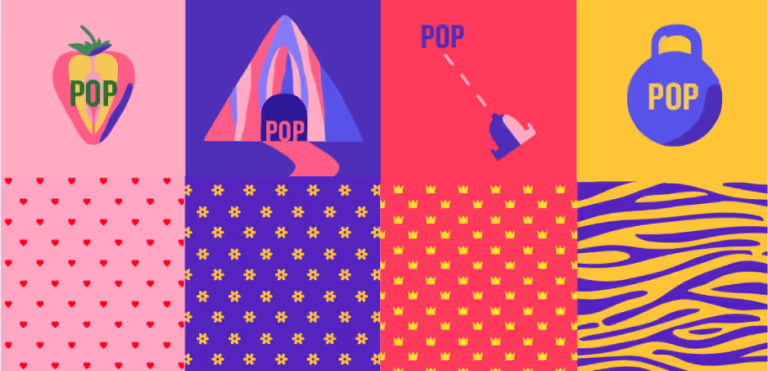
Patterns
The patterns of POP are inspired by the different flavours and feelings users get to experience while using the condom. Heart pattern – for the adventurous who enjoy some added pleasure, flower pattern – for getting more intimate with its thinner texture which increases sensitivity, crown pattern – for longer, lasting pleasure, and tiger pattern – for those who like it rough, with extra protection.
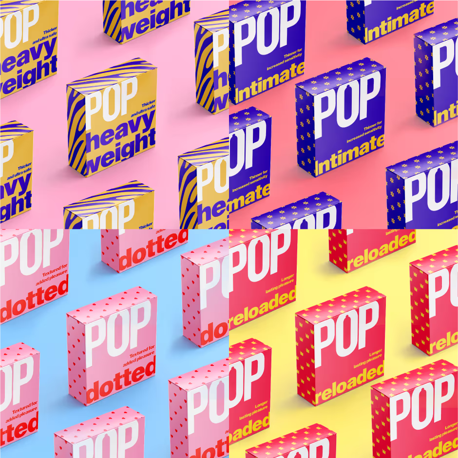
Packaging
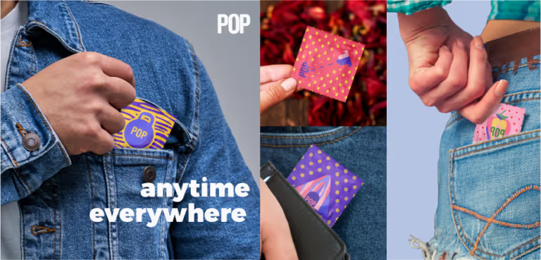
With its colourful and attractive packaging, users do not have to be discreet or shy when they are purchasing or holding on to POP. It was designed to look less like a conventional condom, and more like a stylish accessory.
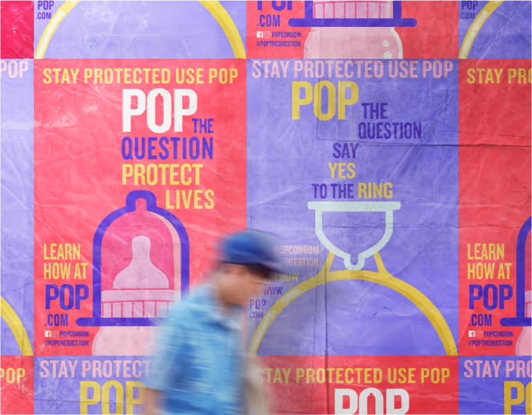
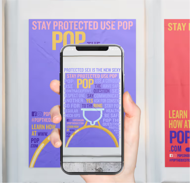
Educating healthy sex
The interactive posters of POP feature a QR code, where users can scan using their mobile devices to learn more about the use of condoms and general sex education knowledge.
Go POP!
Bring it everywhere – stay safe and sexy while having fun!


.png)
you may also like
Subscribe to get notified when new downloadables drop. Straight to your inbox.
Take it one step further. Book a free consultation with us and let’s talk strategy.

.svg)

