


_logo%201.svg)


Enterprise Go

Established in December 2011, Enterprise Go is a global F&B importer and distributor. The brand aims to simplify the product sourcing journey, unlocking new marketplaces for our clients with ease.
Enterprise Go approached Superminted to consult on brand strategy and to develop its brand identity. Through our brand strategy session we established the brand vision to be the go-to business partner for market development in Southeast Asia.
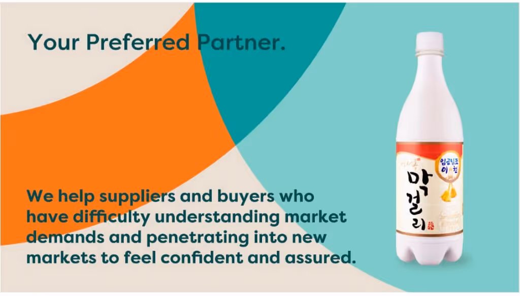
As part of this exercise, SPMT also developed Enterprise Go’s tagline, “Your Preferred Partner”. Based on the brand strategy, we created a dynamic visual identity system that reflected the brand’s partnership with their clients and their strength in connecting these clients with the right products.
Brand identity development
The overall logo concept was derived by defining three key attributes to describe Enterprise Go’s personality – resourceful, smart and caring. The overlapping elements and circular format of the symbol represents connection, exploration and the sharing of knowledge. The logo consists of two symbols, the letter “e” and a globe which represents trade. Colours, amber and teal, were selected to express a warm and inviting impression.
The concept of connectivity and building partnerships extends into the brand’s icons. The icons consist of interconnecting lines in teal and turquoise with rounded edges for a friendly look. The complementary colours give the icons a dynamic style that is similar to the graphic elements.
Developing brand design elements

The graphic elements are derived from the logo and come in various overlapping quadrants and loops to express the connective intention of the brand.
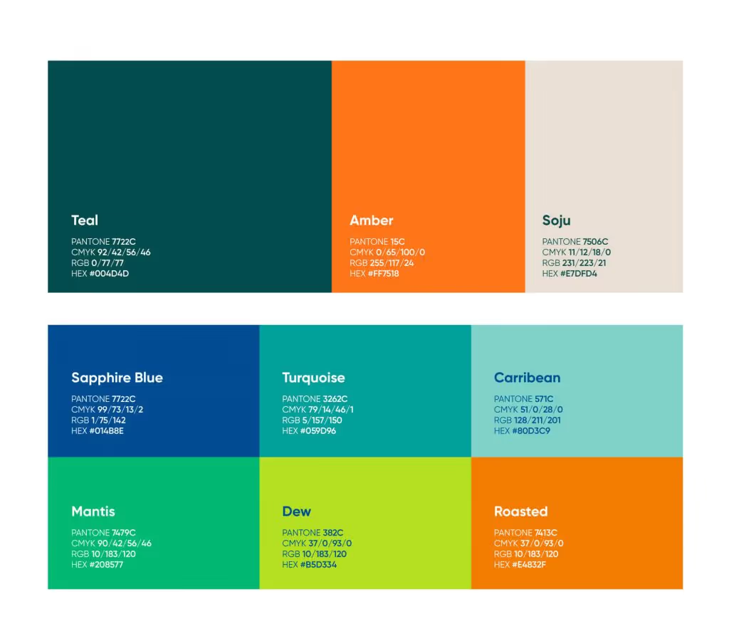
The colour palette is made up of three primary colours – Teal, Amber and Soju, and six secondary colours – Sapphire Blue, Turquoise, Caribbean, Mantis, Dew and Roasted to brighten and add versatility to future brand extensions. The primary colours give Enterprise Go a professional and trustworthy look.
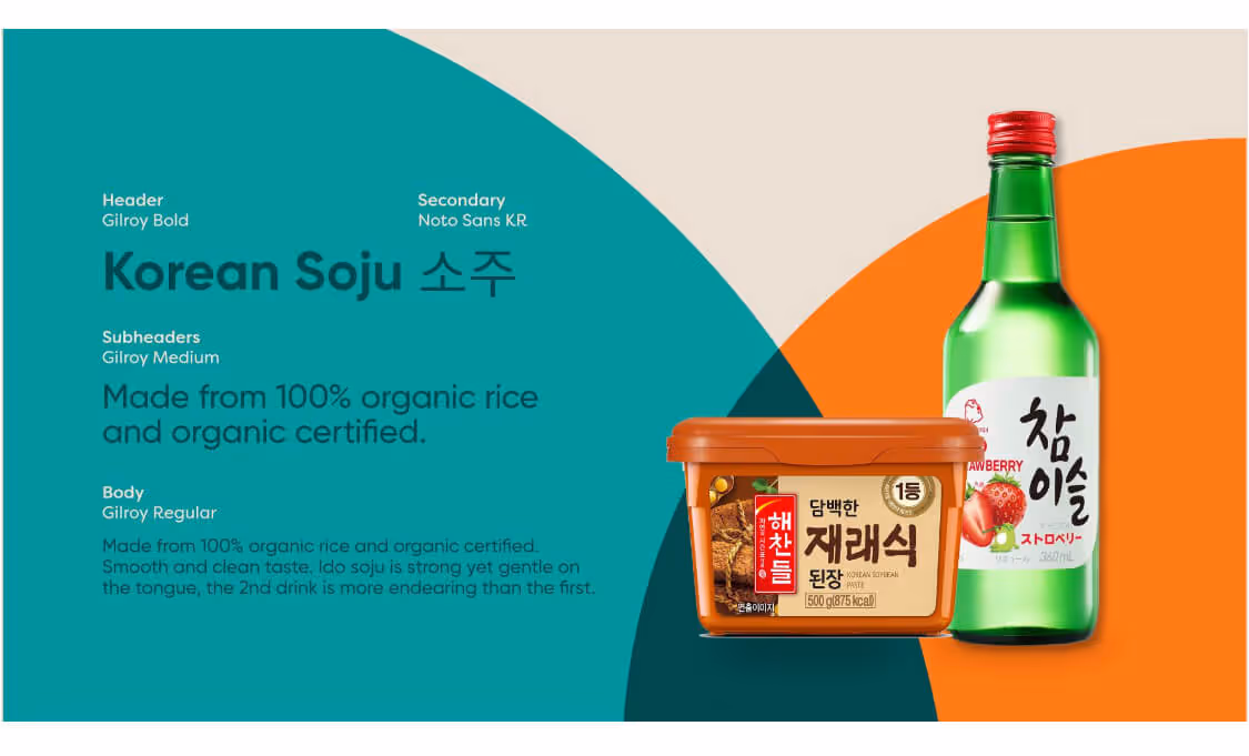
A geometric and simple typography, Gilroy, provides a modern and clean look in its writing. A secondary typeface, Noto Sans KR, can be used for Korean applications.
Conclusion
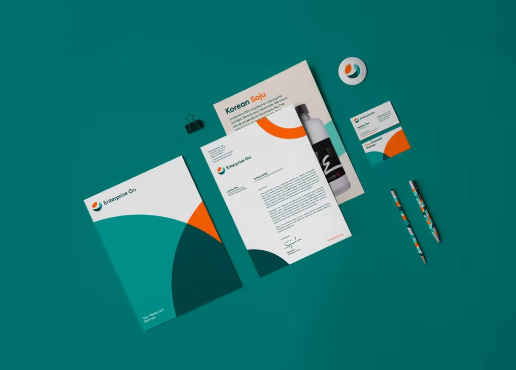
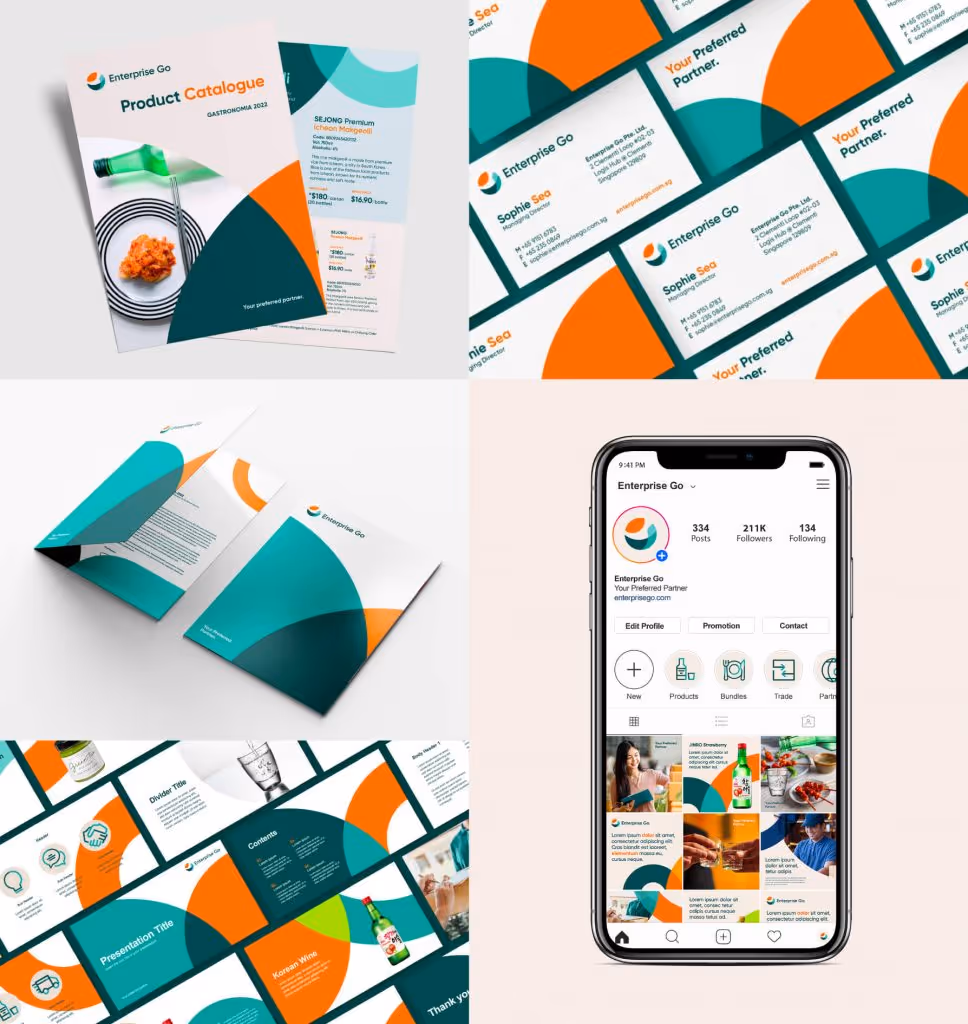
The brand collaterals feature a full set from business cards, letterhead, envelope and folder. We also designed their presentation template and product catalogue. Overall we used a combination of graphic elements and product visuals to bring out the distribution business of Enterprise Go.


.png)
you may also like
Subscribe to get notified when new downloadables drop. Straight to your inbox.
Take it one step further. Book a free consultation with us and let’s talk strategy.

.svg)

