


CASE 50th Anniversary Visual Identity
Celebrating the Golden Jubilee
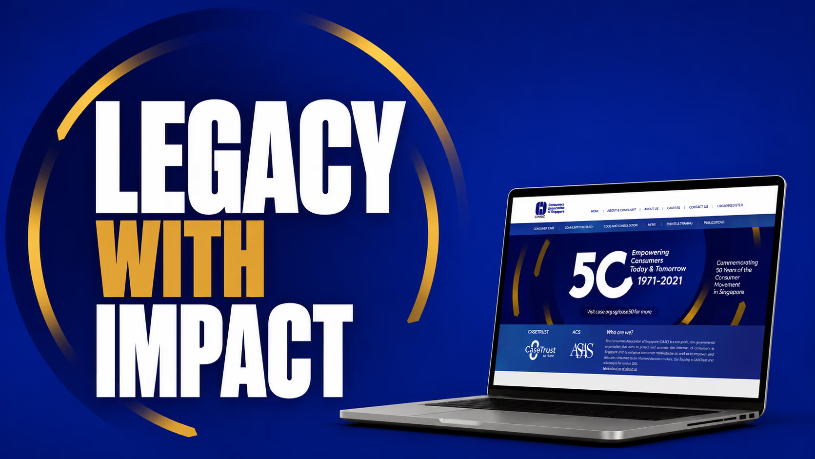
The Consumers Association of Singapore (CASE) is a non profit, non governmental organisation that is committed towards protecting consumers’ interest through information and education, and promoting an environment of fair and ethical trade practices. Our agency was engaged to design the anniversary logo and a series of collaterals to celebrate their Golden Jubilee year.
Past, present and future
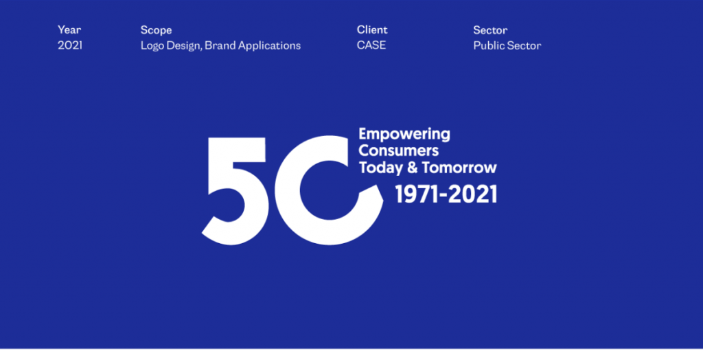
“Past, Present, and Future” is the theme of the 50 year anniversary. CASE wanted to celebrate their journey of guiding consumers throughout time and into the future, empowering them every step of the way.
Brand visual identity development
The logo integrates the anniversary tagline to highlight the theme of the anniversary — Past, Present and Future. The arrow is designed with a sense of motion to represent the passage of time. The logo concept incorporates the arrow into the shape of the number 50 to create a sense of motion — moving forward. While the arrow head denotes the future, the circular motion of the arrow reflects how the past can provide a strong foundation for CASE to strive towards greater excellence in the future.
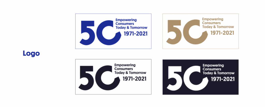

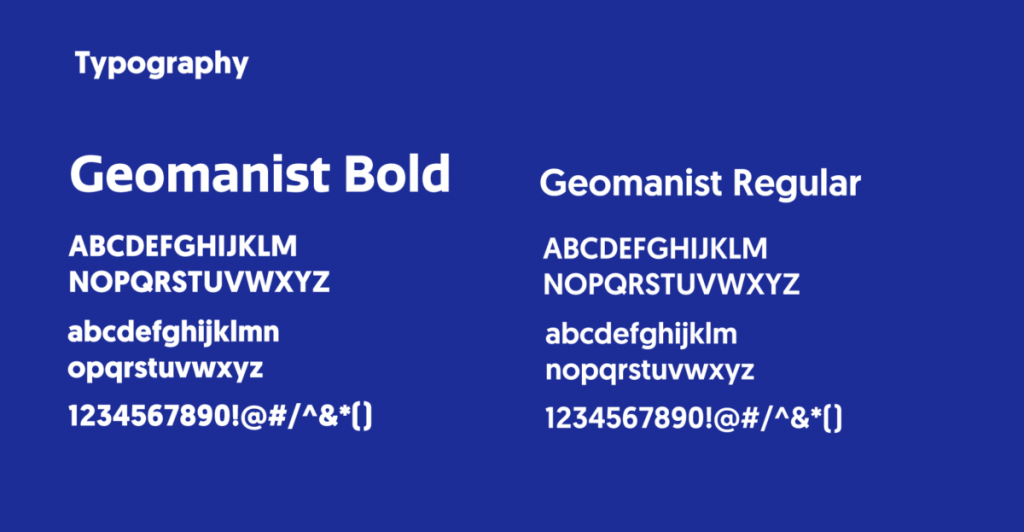
The colour palette uses classic colours to bring out the professional and reliable personality of CASE. Gold highlights the celebratory mood of a Golden Jubileee. For typography, Geomanist Bold is chosen as the logotype for its geometric type. It complements the bold and rounded shape of the number 50. Geomanist regular is used as the body.
In the spotlight
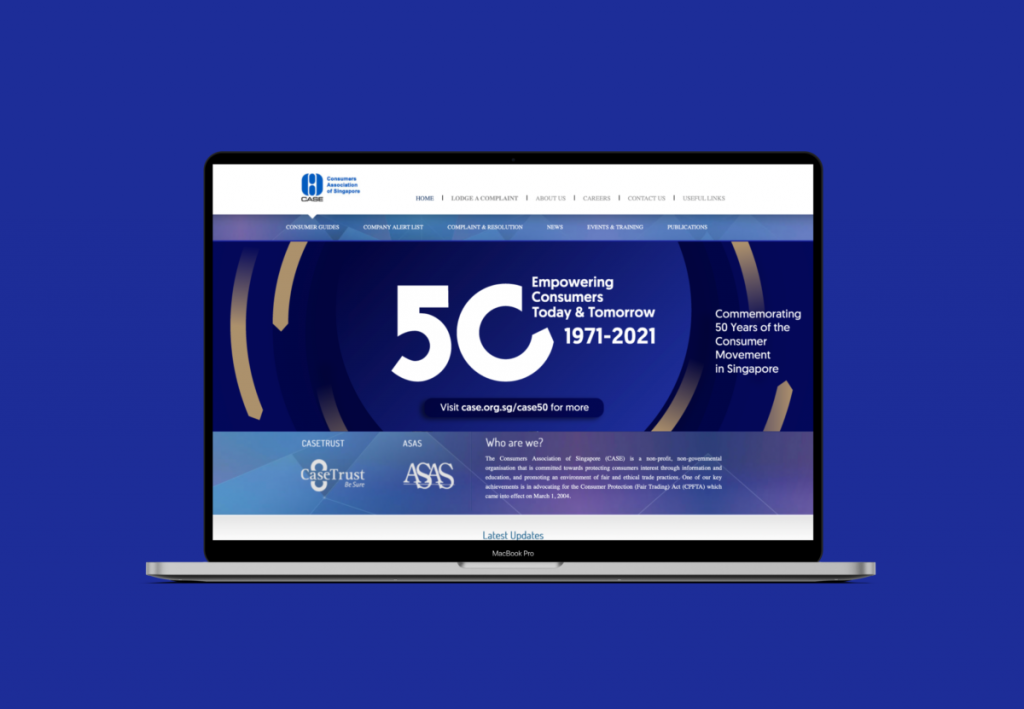
The circular arrow is applied as a graphic element throughout the digital collaterals including social media profiles, digital banners, and email signature. Multiple circular arrows circle around the background to reinforce the theme of past, present and future. The dark background is contrasted with a bright blue circle in the middle, bringing attention to the centre, akin to a spotlight. The spotlight and arrows create a sense of movement as though bringing consumers from the past to the present and into the future.


Conclusion
The 50th Anniversary logo marks a milestone for CASE. It re-establishes their commitment to protecting consumers. We developed a logo and a set of collaterals that represents their presence in supporting consumers from past till present and their intentions of moving forward towards the future



you may also like
Subscribe to get notified when new downloadables drop. Straight to your inbox.
Take it one step further. Book a free consultation with us and let’s talk strategy.


